The new logo and branding was unveiled on Friday at an event described as “a blast” by Simonas Bartkus, Marketing and Communication Director at Girteka Logistics. He later toasted the change with colleagues at the opening of Girteka’s new office, a 14,000 square metre facility with an “exclusive” interior that sports a library, a restaurant, and a gym.
“We introduced our new positioning for Girteka: Responsible Logistics. We revealed our new branding: the first major change in 26 years of history. We made all announcements during the annual Leadership Conference with 10+ international speakers. And to finish the day: a housewarming party for the new office of Girteka Park,” wrote Mr Bartkus on LinkedIn.
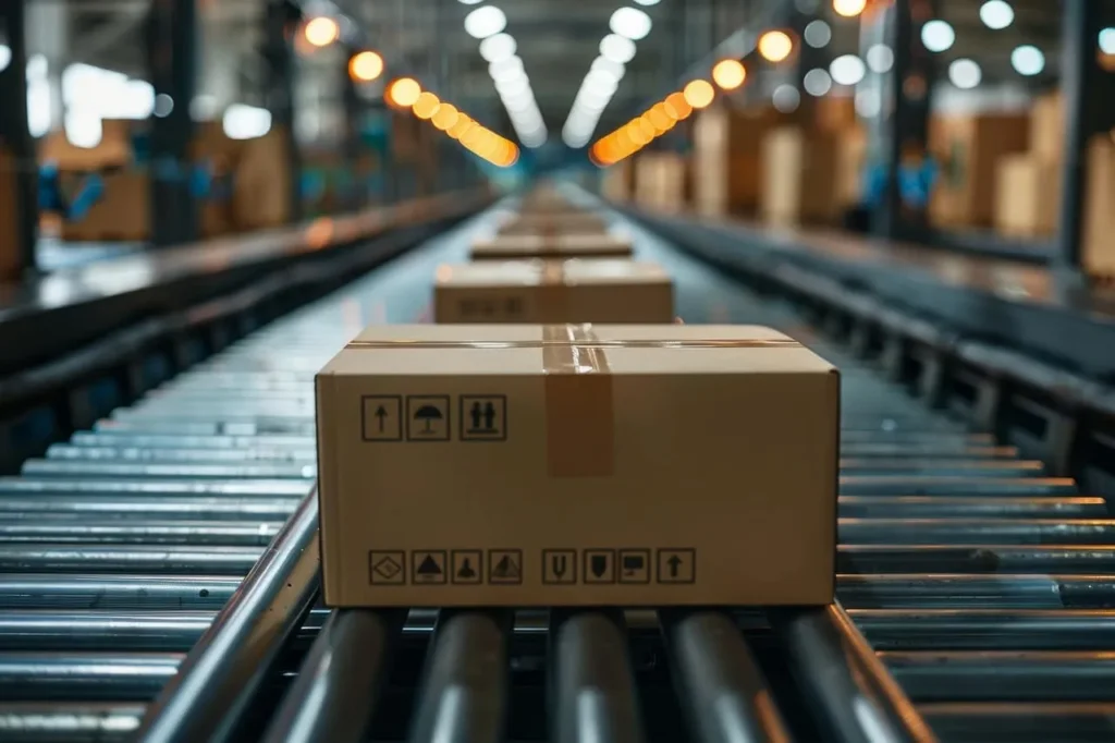
In a statement released today, Girteka Logistics added that the new logo and branding, which represents “reliability and growth”, marks a new direction for the company.
“Girteka is striving to become a company known for Responsible Logistics and has its principles implemented into its business model: state-of-the-art technologies on its trucks, focus on efficiency, quality, and digitalization. The company is ready to expand this notion to environmental, societal, and employee well-being commitments,” reads the logistics firm’s official press release.

Photo: Girteka Logistics
“The notion of what should make us the first choice is expanding. It no longer means just commercial aspects of our activities, but also extends to environmental, societal and employee well-being commitments. We’re changing our identity not only to show that, but to better understand the client and offer ideas and solutions that positively change the market,” says Edvardas Liachovičius, CEO, Girteka Holding.
According to Girteka Logistics, the new visual identity is “a big step forward in a brand evolution”.
The company explains that the choice of green represents growth, expansion and denotes company’s focus on sustainable solutions. Meanwhile, the shades of blue are supposed to “signify experience, trust and reliability”.